
| HIGHLIGHTS Index | Presentation | Publications | Press & News Media | Data | Infographics | Images | Visualisations |
Global Carbon Budget
Visualisations
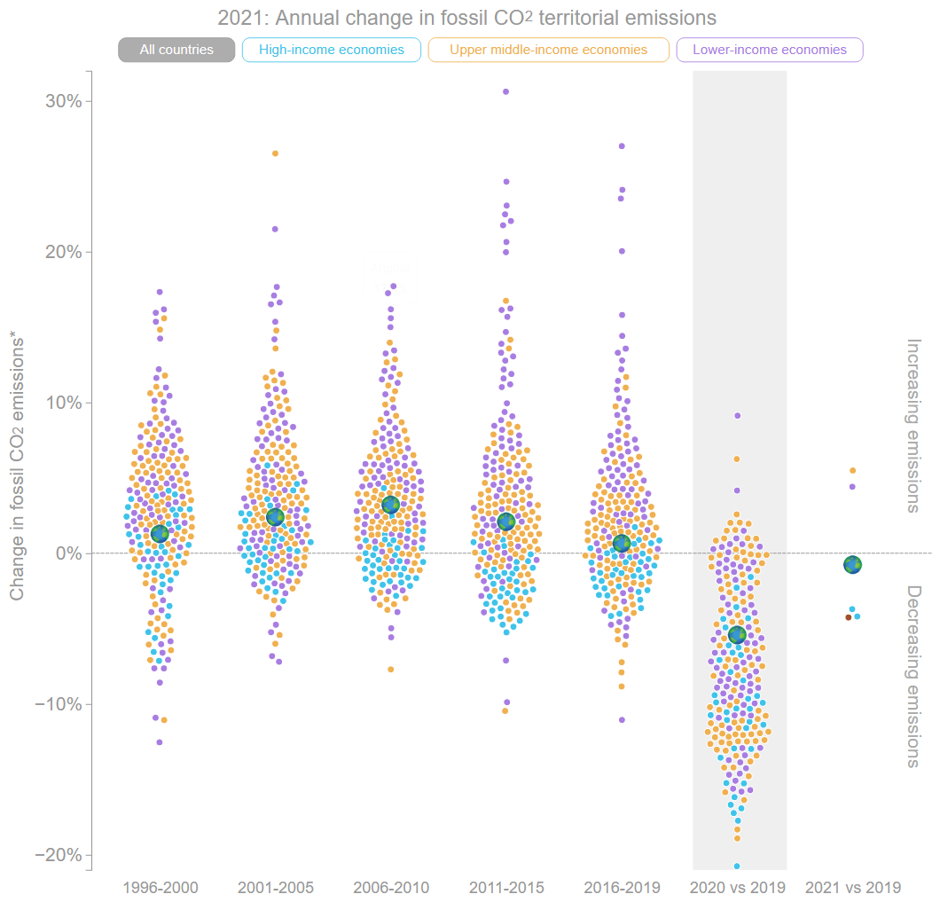
2021: Annual change in fossil CO2 emissions This visualisation from Enactive Science shows the annual change in territorial and consumption emissions for different economies. Enactive Science |
|
The carbon budget for 1.5°C From Future Earth and the Global Carbon Project, this animation shows the atmosphere as a "bucket" filling with greenhouse gas pollution, from 1870 to 2020. Concept by Rob Jackson, visualisation by Alistair Scrutton (Future Earth) and Jerker Lokrantz (Azote). See also: Assumptions and choice of data used. The data used to create the animation. YouTube MP4 (4.5MB) Animated GIF (80MB) |
Global Fossil CO2 Emissions From Future Earth and the Global Carbon Project, this video shows the history of global fossil CO2 emissions from 1955 to 2018. MP4 (English, 2.6MB) |
|
Top 20 Country Carbon Dioxide (CO2) Emission History (1960-2017) From WawamuStats, this video using data from CDIAC shows the Top 20 countries by the total annual carbon dioxide emission (CO2 emission) from 1960 to 2017. The United States contributed to almost 1/3 of the entire world's CO2 emissions in the 1960s but China and India started catching up in the early 2000. YouTube |
Global Carbon Budget 2017. A video produced by Future Earth for the Global Carbon Project. Creative Agency: PixelDust Studios. YouTube (English) YouTube (Spanish voiceover) MP4 (English, 76.7MB) MP4 (Spanish voiceover, 76.4MB) MOV H264 (English, 519MB) MOV H264 (Spanish voiceover, 519MB) |
|
The carbon cycle. From the World Meteorological Organization (WMO), this IG3IS animation on "The carbon cycle" provides basic background about rising atmospheric levels of greenhouse gases. YouTube |
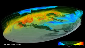
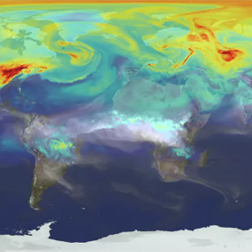
Carbon Dioxide from the GEOS-5 model. This visualisation by Greg Shirah provides a high-resolution, three-dimensional view of global atmospheric carbon dioxide concentrations from September 1, 2014 to August 31, 2015. The visualisation was created using output from the GEOS modeling system, developed and maintained by scientists at NASA. NASA/Goddard Space Flight Center |
|
The Great Decoupling. The story of energy use, economic growth, and carbon emissions in four charts by Rob Jackson, Josep Canadell, Philippe Ciais, Corinne Le Quéré, and Glen Peters. Data visualisation by Nigel Hawtin. Anthropocene |

|
CO2 emissions in imported goods as a share of domestic emissions, 2014. From CO2 and other Greenhouse Gas Emissions by Hannah Ritchie and Max Roser ourworldindata.org |
|
A Brief History of CO2 Emmissions. Together with the Potsdam Institute for Climate Impact Research (PIK), the Urban Complexity Lab of the University of Applied Sciences Potsdam (FHP) developed an animated short movie that visualises the carbon dioxide (CO2) emissions of the past and the possible future. YouTube Urban Complexity Lab |
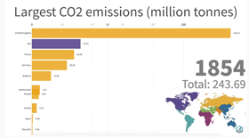
Yearly CO2 Emissions for the Top 10 Emitting Countries (1850-2013). A data visualisation by PeterPain in Data Is Beautiful. YouTube GIF (gfycat.com) |
|
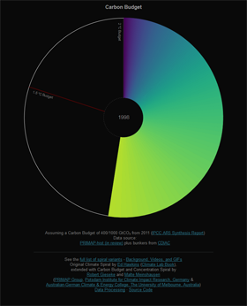
Remaining carbon budget to 1.5°C and 2°C, CO2 concentration, and global mean temperature. Original Climate Spiral by Ed Hawkins (Climate Lab Book), extended with Carbon Budget and Concentration Spiral by Robert Gieseke and Malte Meinshausen (PRIMAP Group, Potsdam Institute for Climate Impact Research, Germany & Australian-German Climate & Energy College, The University of Melbourne, Australia). openclimatedata.net Inspired by the original, the Climate & Energy College created more climate spirals. Climate & Energy College |
|
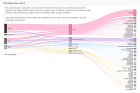
CO2 emissions in MtCO2 from five major sources and their distibution over region and country. A data visualisation by Cathy Nangini and Patrick Brockmann, LSCE. LSCE |
|
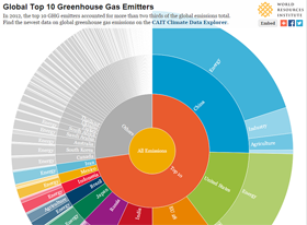
Global Top 10 Emitters using CAIT emissions data for 2012 by country and economic sector. An interactive inforgraphic by Johannes Friedrich, World Resources Institute. Photo by World Resources Institute. World Resources Institute |
|
A Year In The Life Of Earth's CO2. Developed by NASA's Goddard Space Flight Center NASA/Goddard Space Flight Center See also: An interactive video map by the Cartography and Geovisualization Group, Oregon State University. co2.digitalcartography.org |
|
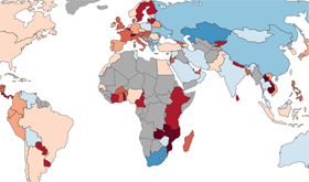
The carbon map: making sense of climate change responsibility and vulnerability. An interactive map created by Duncan Clark and Robin Houston, Kiln. The Guardian www.carbonmap.org |
|
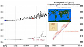
Time history of atmospheric carbon dioxide from 800,000 years ago to January 2016. Developed by Andy Jacobson, NOAA/ESRL. NOAA/ESRL |
|
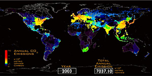
Carbon dioxide emissions from fossil fuels and cement production, from 1751 to 2007. Developed by Robert Andres, CDIAC. MP4 (14.2MB) AVI (97MB) AVI in ZIP (85MB) |
|